Please ensure Javascript is enabled for purposes of website accessibility

Mobile-First Design: A Must for Creating Responsive Websites and Enhancing User Experience

August 16, 2024

Mobile-First Design: A Must for Creating Responsive Websites and Enhancing User Experience

Simply The Best Digital Marketing photo showing responsive web design displaying the same website across multiple mobile devices and computer monitor on a white and wooden-top table in a white room

Mobile-First Design: A Must for Creating Responsive Websites and Enhancing User Experience

At Simply The Best Digital, we live by a mantra that’s steadily becoming a universal truth in the digital world: “Mobile-First Design is the future of website design.” But what exactly is mobile-first design, and why is it crucial for creating responsive websites that offer an enhanced user experience? Let’s dive in.

Simply The Best Digital Marketing image of outlined devices (iPad, Mobile, Laptop, and Computer Monitor) showing "flexible images" in responsive mobile web design

What is Mobile-First Design?

Mobile-first design is a design philosophy that prioritizes the development of a website for mobile devices first and then scales it up to larger screens (like desktops). This strategy is born from the realization that more users are browsing the web on their smartphones now than ever before. Consequently, we need websites that are not only compatible with mobile devices but also designed specifically to enhance the user experience on smaller screens.

Simply The Best Digital Marketing photo of laptop displaying "Best Web Design" title on a responsive web design page on a wooden table with a green plant, a mobile phone, glasses, and a notepad with a pen next to it

Why is Mobile-First Design Important?

Mobile-first design is important for several reasons. Firstly, it enhances user experience. By focusing on mobile design, we can create streamlined sites that work brilliantly on smaller screens, reducing the chances of users getting frustrated and leaving your site.

Moreover, Google recognizes the significance of mobile browsing and has shifted to mobile-first indexing. This means Google predominantly uses the mobile version of the content for indexing and ranking. Therefore, a mobile-optimized site can improve your search engine ranking, driving more organic traffic to your site.

Mobile-First Design and Responsiveness

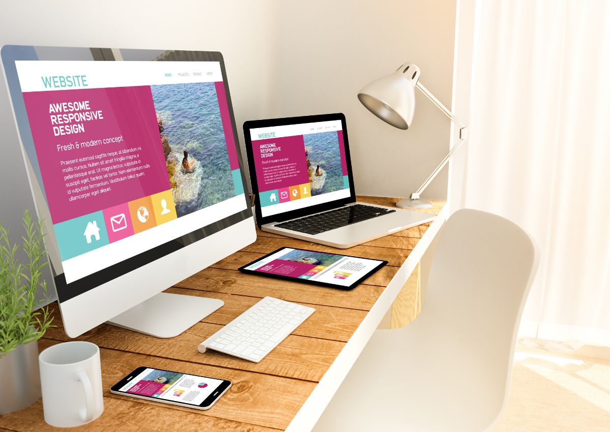
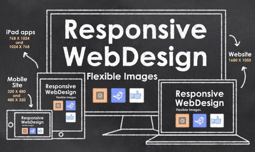
Mobile-first design is inherently linked to creating responsive websites. A responsive website is one that changes based on the needs of the users and the device they’re viewing it on. By starting with mobile-first design, we’re ensuring your website is already primed to respond effectively to users’ needs no matter what device they use.

Key Elements of a Mobile-First Design

  • Simplicity is the Ultimate Sophistication

    Mobile screens are smaller, so it’s vital to keep design elements simple and focused. Avoid clutter and ensure the most important information is front and center.

  • Easy Navigation

    Mobile users should be able to navigate your website easily. Opt for a simple menu and clear call-to-actions that guide users.

  • Touch-friendly Design

    On mobile devices, users will navigate with their fingers, not a mouse. Make sure all buttons, links, and forms are large enough to be selected with a finger tap.

  • Fast Load Times

    Mobile users often have slower internet connections than desktop users. Compress your images and streamline your code to ensure your website loads quickly on mobile devices.

Our Approach at Simply The Best Digital

At Simply The Best Digital, we’re experts in mobile-first design. We believe that creating responsive websites begins with understanding and prioritizing the mobile user experience. We’re committed to helping our clients build websites that not only look great on all devices but also deliver an outstanding user experience and enhance their SEO efforts.

So, if you’re ready to embrace the mobile-first philosophy and take your website to the next level, get in touch with us today. We can’t wait to help you create a website that’s truly designed for the future.

Frequently Asked Questions about Mobile First Design

Website Design2025-01-27T19:40:43+00:00

Welcome to our Frequently Asked Questions (FAQs) section.

Crafting the perfect website design can feel overwhelming, especially with so many factors to consider. That’s why we’ve compiled answers to the most frequently asked questions about website design—from creating visually stunning layouts to ensuring functionality and responsiveness. Our goal is to provide clarity and transparency, helping you understand every aspect of the design process. If your question isn’t covered here, don’t hesitate to contact us directly—we’re here to bring your vision to life!

Frequently Asked Questions on Website Design

Website design focuses on the look, layout, and functionality of your site. It’s crucial for creating a positive user experience and building brand credibility.

The right design depends on your business goals, target audience, and branding. We work closely with you to create a design that reflects your vision.

A user-friendly website has a clean layout, intuitive navigation, fast loading speeds, and responsive design to ensure accessibility on all devices.


Yes, we provide fully custom website designs tailored to your business needs, ensuring a unique and professional online presence.

The timeline depends on the project scope, but a typical design process takes 4-6 weeks, including planning, wireframing, and finalizing the design.

Absolutely! We design websites to be scalable and adaptable, so you can update or redesign as your business grows or evolves.

Yes, all our website designs are fully responsive, ensuring they look and perform great on desktops, tablets, and smartphones.

Branding ensures consistency in visuals, colors, and messaging, helping to create a cohesive and recognizable identity across your website and marketing materials.

Yes, we can integrate your website with platforms like e-commerce systems, CRM tools, or marketing software to streamline your business operations.

We incorporate SEO-friendly elements like optimized layouts, fast loading speeds, and structured content to improve your website’s search engine visibility.

Gradients2025-01-27T19:42:53+00:00

Welcome to our Frequently Asked Questions (FAQs) section.

Gradient design can add a striking and modern touch to your website, but understanding how to use it effectively can be tricky. That’s why we’ve gathered answers to the most common questions about gradient design, from creative techniques to practical applications that elevate your visuals. Our goal is to make the process simple and inspiring, empowering you to create designs that truly stand out. If your question isn’t covered here, reach out to us—we’re always ready to help bring your ideas to life!

Gradients add depth, texture, and emotion, creating more engaging and immersive experiences.

Yes, gradients can be tailored to suit any brand personality, from professional to playful.

Use high-contrast text or overlays to maintain readability.

Tools like CSS Gradient, Adobe Color, and Figma are excellent for creating and experimenting with gradients.

Subtle transitions, vibrant neons, and dynamic animations are leading the way.

Share This Story

About the Author: Chris Jacques

Chris obtained his Bachelor of Science degree from Southeastern University where he studied Communication & Mass Media with a focus on marketing. He has more than 20 years of digital marketing experience and he has worked with some high-profile clients including Amazon and ESPN.

Contact an Expert

Go to Top